Sunday, 9 November 2014

Let it Snow -- it's all silver and white

Where I live it's really not that unusual to have snow on the ground already by the beginning of November so I knew we were living on borrowed time, enjoying the mild Autumn weather.  Alas, it all came to an end when it began snowing yesterday afternoon and hasn't figured out how to stop yet.  We already have at least six inches on the ground right now.  Considering that on Saturday morning we still had green grass, that's a lot of snow.

Yes, it's pretty.  Right now it's very sparkly and clean.  Later, when there is all that road dirt and sanding it won't be so pristine and pretty but right now I have to admit that it's picture perfect.  Of course I used that as my inspiration for the card that I created to enter some challenges.  The Stampin' Royalty, for example, called for silver to be used in a card while the Freshly Made Sketches had the perfect sketch for what I had in mind:
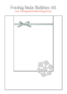
Can't you just imagine that sketch in white and silver?  

I began with a base of Smoky Slate and then added a layer of that wonderful silver-foil-dotted All Is Calm Specialty Designer Paper.  For the smaller rectangle I used a base of Silver Foil and then added a layer of Whisper White.  I heat embossed the Whisper White using Versamark and Silver Embossing Powder.  Then I added a die-cut of musical notes to the top, all the while hearing the song "Let it snow, let it snow, let it snow" inside my head.  I added another die-cut, this time a snowflake, to the bottom right of my smaller rectangle and my card was complete.  Simple but oh so pretty in real life.  Sadly silver does not photograph well, especially in the evening.


For more cards using silver, check out Stampin' Royalty.

For more cards using this sketch, check out Freshly Made Sketches.

A Top Note Raggedy Andy

I've always loved the Top Note die.  Actually it's the very first die that I bought from Stampin' Up!  It's an extremely versatile die and I can see why it's stayed current while other dies have come and gone.  Today I decided to use it for a punch art type of card.  My aim was to make the Top Note into a Raggedy Andy.  I thought the line of "stitching" around the perimeter of the die-cut made it a natural for that purpose.

First of all I began with a card base of Naturals White, followed by a layer of Soft Suede and then a layer of the dotted pattern from the Park Lane Designer Series Paper.  Now I was ready to begin my Raggedy Andy.

I cut a piece of Blushing Bride cardstock with the Top Note die for the face.  Then I cut two small ovals of Whisper White for the eyes as well as two 1/2" circles for the blacks of the eyes.  I used the Pennant Builder punch to cut a piece of Real Red for the nose and then cut another piece of Real Red twice with the small oval punch to get the lips.  The hair was easy to cut from the Real Red since we luckily have those wonderful  Fringe Scissors.  I added a slightly curved strip of Whisper White for the brim of the hat and then cut the top of the hat with the Top Note.

A bit of sponging here and there helped contour the hat and face.  A touch from the Signo Ball Pen added a sparkle to the eyes.  My black Stampin' Marker added the lines for his mouth and the lashes to his eyes.  And then I added fake stitching with my black Stampin' Marker as well.

I attached Raggedy Andy to the card using Dimensionals and then added my sentiment (from the Just Sayin' stamp set) with Dimensionals as well.  The final touch was his collar which I cut from Marina Mist with the scalloped portion of the Pennant Builder punch and then his bow tie which is simply a bow tied from Hello Honey ribbon.


For more punch art cards, check out The Paper Plunge challenge.

Saturday, 8 November 2014

Just Add Ink (and a little nostalgia)

I've been looking through a lot of my retired Stampin' Up! products lately.  It's gotten to the point where I have as many (or more) retired stamp sets as I have current and obviously I have to do something about it.  There are, after all, only so many stamp sets that a person actually gets around to using.

A stamp set such as Welcome Christmas, for example, has been sitting on my shelves, never having been introduced to ink.  Well---until now, that is.  I "discovered" the set while rummaging and trying to decide what I should sell and what I should keep and wondered why I had never used it.  There is a challenge at Just Add Ink that virtually begged for this set to be used and so a card was born.  (Oh, and if you're wondering how the battle to reduce my retired products is going, let's just say that my keep pile keeps growing while my sell pile is sadly quite small.)

The colours at Just Add Ink are evocative of an era gone by (for me, at least).  Even the Lost Lagoon colour is actually more of an old-fashioned colour than a modern colour in my opinion.

JAI 239

Along with the Early Espresso and Very Vanilla, the Lost Lagoon looked perfect for the images from the Welcome Christmas stamp set.

For my base I used Early Espresso and then added a layer of Naturals Ivory.  Then I took a piece of Very Vanilla, embossed it with the retired Pretty Print embossing folder, and then sponged over the raised print and edges using Lost Lagoon ink.  I attached the embossed piece to a piece of Lost Lagoon cardstock and then attached the combined piece to the card using Dimensionals.

I had decided to use the negative framelit from the On Film framelits set as frames for my images and so cut out two from Early Espresso cardstock.  Then, using Early Espresso ink, I stamped the two silhouette images from the Welcome Christmas stamp set on Very Vanilla (I did not ink up the little girl in the Christmas tree stamp since she would not fit into the frame).   After fitting the Very Vanilla into the framelit frames, I attached them to my card using Dimensionals.

For my sentiment, I turned to the "Noel" framelit from the Wondrous Wreath framelits dies.  I cut out one from Early Espresso cardstock and another from Gold Foil.  Then I mounted the Gold Foil just offset enough so that the Early Espresso formed a shadow under it.  I used Tombo glue to attach the sentiment to my card.

To finish up I punched out three small stars from Early Espresso and three more from Gold Foil.  I also offset those to form a "shadow" and then attached them using Tombo Glue.


For more cards using these colours, please check out Just Add Ink.

Friday, 7 November 2014

A Vintage Christmas

*Thrilled to be picked a Cut Above at the Paper Players this week!*
*Thrilled to be picked for the Top 3 for the Make My Monday Vintage challenge!*

There are a lot of different interpretations for vintage.  For some it means adding frills and flowers and almost everything but the kitchen sink.  While I admire the look of some of these cards, they aren't "me".  I love things that look vintage, but in a cleaner, more streamlined way.  As a result, when I saw the challenges for vintage cards, I went looking through my retired stamps for those images that evoked another era, a simpler time.


That wonderful Christmas Lodge stamp set, for example, immediately caught my attention.  I love the images in that set and they definitely make me think of what winters long ago must have been like.  Of course the Winter Memories stamp set virtually "sprang" into my hands as well.  Those images are priceless and so well drawn.  Together, they gave me my vintage card.

I decided to create a scene.  I stamped the images I had chosen for my card onto Very Vanilla using Soft Suede ink to give them a look of yesteryear.  After all, during the 19th Century most photographers converted the metallic silver (black and white) with a chemical process involving the Sepia cuttlefish in order to help preserve the prints.  This is why the sepia prints have lasted so well for over a century.  I'm a photography geek so old-time photography has always fascinated me.

You can see the scene I've created is a combination of a whole lot of techniques.  I've added clouds in the background by sponging over a template that I made a while back.  I tore strips of Very Vanilla and sponges them.  I fussy-cut all my images.  I could have stamped and masked the lodge before sponging the clouds, but I wasn't sure at the time if I was going to put it on Dimensionals so I just fussy-cut while I was on a roll.


In a lot of these old photographs you can see just a bit of colour in places, where the photographer has inked in colour to spotlight portions of his finished photograph.  I tried to get the same effect by adding a very light watercolour wash over the tree and the little girl's coat and hat as well as the snow-girl's apron.  I think the result is sufficiently faded looking to give that old-time hand-coloured effect.


I also added quite a bit of the Silver Dazzling Details to all the trees just because that's something you see in a lot of these old cards and postcards:  fine silver glitter.  The bit of retired Victoria crochet ribbon and Antique Brad just finish off the old-time look for me.

My card is on a base of Naturals Ivory with a layer of Soft Suede.  The rest of the cardstock used is Very Vanilla.


For more cards of a vintage nature, check out The Paper Players.

For cards that are using sepia tones as well, check out Merry Monday Christmas Challenge.

And for another challenge that calls for vintage cards, check out Make My Monday.


Tuesday, 4 November 2014

Simple Joy

What I was aiming for:  a simple card in non-traditional Christmas colours.  I achieved that by using one of my top favourite stamp sets, Lovely as a Tree along with a much-loved but retired stamp set, Winter Memories.

I used a base  of Naturals White, then a layer of Basic Black and then a layer of Whisper White which I first prepared by stamping.  I used a small acrylic block and three blues:  Soft Sky, Pool Party and Coastal Cabana.  First I spritzed the Whisper White with alcohol, then I stamped the three colours using my acrylic block, and finally I spritzed more alcohol over the stamped colours.

Once that dried, I stamped over the blues with my pine tree stamp using Memento black ink.  On another little piece of Whisper White I stamped only the little boy, dog and snowman from the Winter Memories stamp using Memento black ink.  Then I coloured the images using only the same blues and a touch of Smoky Slate and skin tone.  I also stamped only the "joy" from the stamp in the hostess Good Greetings stamp set centred just below the tree.

I cut around the images I had coloured and used Dimensionals to attach the piece in the lower right hand portion of the card.  And that completed my simple Christmas card.


You can see I flipped the sketch from the Just Add Ink challenge over on its side.  For more cards using this sketch, check out Just Add Ink.


For more cards using non-traditional colours for their Christmas cards, check out "Less is More".

Monday, 3 November 2014

Remember my closing Scalloped Tag Topper Box?

If you read my other blog, you'll remember my closing Scalloped Tag Topper Box.  I shared the template and step-by-step instructions with anyone who wished to try one on the condition that they would not sell the instructions or take credit for the design themselves.  Well, it's time for me to have some fun with that box again.  This time I'm going to enter a Thanksgiving box into two challenges.

I'm not going to go into details for the box again.  I've posted everything and provided clear photo instructions here if you're interested.  This post is about the same box but making it different.

I began with a box cut from Naturals White.  I wanted something light but neutral for my base.  For my next layer I added Cajun Craze, which worked perfectly with the retired Orchard Harvest Designer Series Paper that I had chosen to use.  I love all the bright colours in that paper and picked the apple pattern for two sides of my box and the corn pattern for the other two sides.  For the handles, I chose the stitched pattern which pulled all the colours together.

I added some leaves cut with the Fun Fall Framelits and pieces of Cajun Craze, Hello Honey and Pear Pizzazz to a banner on which I had stamped my sentiment from the retired Day of Gratitude stamp set.  A piece of Hello Honey ribbon and a retired Designer Naturals button finished it off.


For more projects that are not cards, check out The Paper Plunge Challenge.

For more boxes for Thanksgiving, check out The Friday Mashup.


Sunday, 2 November 2014

Ode to Remembrance Day --- keeping it Clean and Simple!

With all that is happening in Canada and in the world, Remembrance Day is very much on my mind.  My Dad was a veteran and gave out poppies for donations and so, when I come across veterans doing so now, I feel compelled to buy a poppy "for him".  This card is for Remembrance and for my Dad.

I kept the card very Clean and Simple, making it a single sheet creation.  I had this idea in my head and, thankfully, had the stamps to bring that idea into reality.  I used Whisper White for my cardstock because it stamps cleanly and gives crisp images.  For my background stamp, I used the Hero Stamps "Delicate Blossoms".  I love the poppies in that set but only inked up one.

Over that poppy, I stamped the silhouette from the Stampin' Up! "For Your Country" stamp set.  I put it over towards the right side to avoid interference from the dark centre of the poppy.  Luckily I also had a sentiment that would work for my card and that came from the Stampin' Up! Project Life "Remember This" stamp set.

I coloured the poppy using my Cherry Cobbler Blendabilities.  I also went over the silhouette with my Stampin' Basic Black marker just to give it more depth.  Finally I added a touch of green to the grass.

I left a lot of white space to call attention to my images.  I hope you like it.


There are two challenges into which I'm entering this card, both of which call for CAS (clean and simple) cards.

Please check out CAS on Sunday.

And also check out Addicted to Stamps and More.

Saturday, 1 November 2014

Baby, It's Cold Outside!

I love it when old and new work together, don't you?  Some of the retired stamp sets and Designer Paper still tug at my heart when I see them and I'm thrilled when I get a chance to dig them out and use them again.  That's what happened with the Best of Snow stamp set and the Sweater Weather Designer Series Paper.  I finally got a chance to use them with the two challenges I found this week.

I really love the sketch that they've offered at the Paper Craft Crew Challenges:

Paper Craft Crew Card Sketch 116

And thought the sketch would work beautifully with the colours at the Color Throwdown Challenges:


The adorable little hedgehog building a snow-hedgehog is one of my favourite images and I knew it would be great for this card.  Looking through my Designer Paper, I found the right colours in the Sweater Weather paper and so my card was on a roll.

I began with a base of Pacific Point, added a narrow layer of Basic Black to form a thin frame for my next layer which was Whisper White.  I spritzed the Whisper White using my Pacific Point Stampin' Marker and the retired Colour Spritzer Tool.  

For my small rectangles, I made one with a base of Basic Black and a layer of the Designer Paper.  The top small rectangle, however, I cut from Basic Black using my On Film framelit and stamped a small piece of Whisper White to fit the centre.  The stamp, of course, was of the little hedgehog.  For the image I was able to add the yellow and orange in the scarves and carrot nose, some more black to the "coat" and a bit of Pacific Point to the snow.

I stamped my sentiment using the Project Life Holiday Cheer stamp set with Pacific Point ink and cut that out using my 1" circle punch.  I cut a backing of Pacific Point with my 1 1/4" circle punch.  The final touches were a piece of the 3/4" Basic Black Chevron Ribbon and a banner of Dazzling Diamonds Glimmer paper.

For more cards using this sketch, check out the Paper Craft Crew Challenges.

For more cards using these colours, check out the Color Throwdown Challenge.

For more cards featuring adorable little creatures, check out jingle belles.

Friday, 31 October 2014

All is Calm

*So thrilled to be a Top Pick at Stampin' Royalty this week!*

I love the retired stamp set, Come to Bethlehem.  It has such wonderful images and suits the All is Calm Specialty Designer Series paper perfectly.  It also works beautifully with this week's sketch at the Stampin' Royalty challenge.


For this card I chose to use two of the patterns from the Designer paper.  Both had the Lost Lagoon colour in common and so I decided to use Lost Lagoon as my base.  On top of that I layered a piece of Naturals White which I first embossed using the Decorative Dots embossing folder.  Before adhering it to the base, I added a strip of the Designer paper and some 1/8" Silver Ribbon simply tied towards the lower right side.

For the larger shape with the curved corner, I chose another design from the Designer paper and backed it with a piece of Lost Lagoon.  I cut the circle from Whisper White using my 5th from the smallest circle framelit and backed it with a piece of  Soft Sky cut with my 2 1/2" circle punch.  I stamped a portion of the image from the Come to Bethlehem stamp set onto the Whisper White in Lost Lagoon ink.  Then I cut a star from the Silver Foil paper and attached that above the buildings using Dimensionals.  I also attached the circle to the card using Dimensionals.

For my sentiment I used the Teeny Tiny Wishes stamp set, using Lost Lagoon ink on Soft Sky cardstock and then cut it out with my Word Window punch.  I backed it with Silver Foil cut with my Modern Label punch and then attached it using Dimensionals.


For more cards using this sketch, check out Stampin' Royalty.

Monday, 27 October 2014

If the hat fits...

I thought it would be fun to make another single layer card for Halowe'en.   It takes some planning, but that type of Clean and Simple card can be so effective.  This time I chose to make it into a scene.  It's simple, but represents a magical moment in time at the witch's house.

I decided to follow the sketch from a new challenge I found:  Stamplorations


My little scene worked itself into this sketch perfectly.

My cardstock is Naturals White which gives the card some character right from the start with those little specks and variations.  I used Memento Black ink for all my stamping and added a touch of Real Red to the bat's eyes.  I sponged my oval with Pear Pizzazz ink, after first masking the hat and the bat.  Then I added tiny dots of Tombo glue to which the Orange Stampin' Glitter stuck nicely.  I also added a few random dots of Dazzling Details.  The magic seemed to be rising from the broom!


For more cards using this sketch, check out Stamplorations.

For more single layer cards, check out CAS on Sunday.

Saturday, 25 October 2014

Boo to you, little witch!

*Thrilled to be among the top picks at ColourQ Challenges.*

I decided to take out the retired Greeting Card Kids stamp set to use that adorable little witch sitting on her pumpkin for my card today.  That stamp set just begs to be coloured with the new Blendabilities and that was my plan.  It's nice when my plan and a couple of challenges go hand in hand, too.

The AAA Cards is having an "inspired" challenge and this is the image from which to take inspiration:


That's right---it's a Hallowe'en challenge and all styles of cards are welcome.  The other challenge which is just perfect for my card is the colourQ challenge:


I love it when challenges work together.

My card is a single layer card for which I've used Whisper White because it stamps so clearly and cleanly.  I stamped the little witch just about dead centre.  Then I added my sentiment from the hostess Good Greetings stamp set just below her.  Finally I took my Project Life Journalling pen and, using my third to largest oval framelit, traced a black oval around both, adding a few leaves as I went along..

I used my Pumpkin Pie and Wisteria Wonder Blendabilities sets for the pumpkin and the little witch's dress, hat and socks.  Then I used my skin colour Blendabilities set for her face, arms and knees.  For the leaves and strip of grass and the little witch's cloak, I used the retired Certainly Celery Stampin' Marker.


For more cards using the Hallowe'en inspiration, check out AAA Cards.

For more cards using these colours, check out colourQ challenges.

And for even more Hallowe'en inspirations, check out Make My Monday.

Friday, 24 October 2014

Hallowe'en on Stage

Shortly after I became a Stampin' Up! Demonstrator in November, 2011, I designed what I called a "stage card".  I had seen side step cards but wanted something different.  My original card and template were for a 5" x 7" card.  I've now redesigned the template so that it can be made into a 4 1/4" x 5 1/2" card.   The first card I made with these measurements was for our latest blog hop.

As promised, I'm posting the template with this new card that I've created for the Paper Plunge challenge, which gives as its inspiration:  "It was a dark and stormy night..."  The card is also perfect for the colour challenge currently on Colour Me...!


I decided to try a new technique using re-inkers and Isopropyl Alcohol.  I love the way the colours merged and mixed.  It definitely gives the effect of a very spooky night.

First, my template.  You begin with a piece of 8 1/2" x 5 1/2" cardstock.  I've provided the measurements, cutting lines, and folding lines on the template.  It should be easy to follow.


By the time you've finished your cutting, scoring, and folding, your cardstock should look like this:


And this is exactly what I began with for my card, a base of Elegant Eggplant that I had cut, scored and folded like this.  I followed that with a layer of Basic Black and then a layer of my Whisper White that had been treated with re-inkers and spritzed with alcohol,   You can see the swirls of Blackberry Bliss, Elegant Eggplant, Basic Black and Crisp Cantaloupe in various areas.

Then I used the frog from the Toxic Treats (retired) stamp set and the raven from the Toil & Trouble (retired) stamp set.  The remaining images and sentiment are from the current Photopolymer Tee-Hee-Hee stamp set.  I fussy cut most of them (big surprise, right) and also added some vellum "steam" coming from the cauldron.  The Dazzling Details that I added to the vellum really makes it look like something magical is rising.


For more cards that interpret "a dark and stormy night", check out The Paper Plunge.

For more cards using these colours, check out Colour Me...!

For more cards that are all about Holiday, check out Addicted to Stamps and More.

Sunday, 19 October 2014

The glory of sunflowers

Sunflowers make me smile.  They're a happy flower with those brilliant yellow petals.  I especially love that the centre of the flower matures into seeds for the birds---and I'm sure the birds are happy about that, too.   What luck that I found a sunflower stamp that I absolutely loved a few weeks ago and there is a challenge right now to make a card featuring sunflowers.


And another challenge that shows sunflowers in its inspirational photo.

http://www.pinterest.com/pin/141581982011016413/
{PIN}spirational Challenge #126

Of course I needed a sketch and found a great one at Pals Paper Arts Challenges.

PPA224 Oct 16

And so I was all set.  I began with a base of Naturals White.  Then I took a piece of Mossy Meadow cardstock and attached four pieces of Designer Paper, two from the Park Lane Designer Series Papers and two from the Colour Me Autumn Designer Series Papers.  Once they were attached, I used my Big Shot and Woodgrain embossing folder to emboss the piece before attaching it to my base.

I stamped the sunflowers onto a piece of Whisper White cardstock using my Memento ink and then coloured it using my Blendabilities.  Once that was dry, I mounted the Whisper White onto a piece of Soft Suede using Dimensionals.  Then I covered the little ladybug with a thick layer of Crystal Effects.  My sentiment is from the Holiday Home stamp set and is stamped on Whisper White using Soft Suede ink.  I cut that into a banner and then mounted it on a piece of Mossy Meadow and cut around the whole, leaving a narrow border.  I mounted the sentiment using Dimensionals as well.


For more cards featuring this sketch, check out Pals Paper Arts.

For more cards featuring sunflowers, check out The Card Concept.  I chose to follow the layered designs.

For more beautiful fall flowers, check out {PIN}spirational Challenges.

For more cards featuring markers, chalks and others such tools, check out Addicted to Stamps and More.


Saturday, 18 October 2014

Autumn Colours

I decided to use the alcohol marker marbling technique again because I wanted a background that was a blaze of Autumn colours.  I've used the technique before and describe it here.  Since I wanted to keep this card very clean and simple, I used the marbled glossy paper and did my stamping on it.

My base cardstock is Early Espresso and, as I mentioned, the next layer is the glossy marbled paper.  I used my retired French Foliage stamp set for the wonderful oak leaf that I stamped three times using Early Espresso ink.  Then I used the same ink to stamp the sentiment from the For All Things stamp set.  Finally I used my retired Color Spritzer Tool and my Cajun Craze Stampin' Marker to create spatters of ink randomly on the glossy layer.

My finishing touch was to add three Early Espresso Candy Dots to the top right corner.


For more cards that feature Autumn colours, check out AAA Cards.

Friday, 17 October 2014

Peace in Black and White and Silver

Every once in a while a challenge comes along that immediately makes you think of a finished card.  The one over at Merry Monday Christmas Challenge did that for me this week.  This is their inspirational picture:


I loved the simplicity and was determined to carry it over into my own creation.  For me that included deer, a tree, a star and a simple sentiment, all in black silhouette or silver embossing.

I began with Basic Black for my base and then chose Naturals White for my scene.  I used Lovely as a Tree for the silhouette of my little fir and heat embossed that in black.  Then I used the star stamp from the Something to Say stamp set and heat embossed that and the rays that I drew coming out of it using my Silver embossing powder.

For the deer silhouettes, I turned to my Memory Box dies and Basic Black cardstock.  I attached them using a combination of Dimensionals and Tombo glue.  The sentiment is from the hostess Good Greetings stamp set and heat embossed using my Silver embossing powder.

It's a simple card but I think it evokes a Silent Night, doesn't it?


For more cards using this inspiration, check out the Merry Monday Christmas Challenge.

And for more cards that are clean and simple and also showcase a lot of embossing, check out CAS on Sunday Challenges.

Thursday, 16 October 2014

Simplicity in pairs

It is fun coming up with a card that must be a single layer.  For the "Less is More" challenge, the card had to be a single layer plus it had to showcase two of something.  What's warmer and happier than two kisses?

I decided to use Whisper White as my single layer because it stamps brilliantly.  Then I heat embossed two kisses in silver, one diagonally across from the other.  I used the large splatter from the Gorgeous Grunge stamp set to stamp multiple splatters using Strawberry Slush ink off-stamped twice.  Then I proceeded to stamp "hugs & kisses" five times in black Memento ink and five times in Strawberry Slush ink.

I hope you like the simplicity of my card.


For more cards in one layer and with a pair of something, check out "Less is More".

Monday, 13 October 2014

A colour challenge for Breast Cancer awareness

Cancer affects all too many people.  Whether it's breast cancer, ovarian cancer, pancreatic cancer, or another one, simply hearing the diagnosis sends chills down the spine of the patient and his/her family.  We've lost a number of people in our extended family to cancer.  My husband's mother and father both died of cancer as did his uncle and a cousin.  In my own family, I've been in that chair, hearing the dread words but in my case it was curable and I am happy and so very grateful that I am a survivor and have been for thirty years.

I enjoy the challenges at ColourQ and this one is no exception.  The colours appeal to me.  But, quite honestly, even if they didn't I would enter this challenge simply because of its theme.


Having been in that chair, hearing the diagnosis, the first thing that came to mind as I considered what I would do for this card was "keep calm".  Well, I have that stamp set and, even though it's retired, decided that it would be perfect for my sentiment.  

I used Naturals White as my base and then added a layer of Basic Black and a layer of the retired Pretty in Pink Designer stack pattern.  For my small rectangle I began with a base of Basic Black and then attached a layer of Whisper White onto which I had stamped my sentiment over a background of stamped script from the retired Strength & Hope stamp set.  I attached the small rectangle with Dimensionals and added three narrow banners:  the top one and bottom one in Basic Black and the middle one in Silver Foil.  I drew white "stitches" on the black banners and around three sides of the small rectangle.  The Silver Foil was embossed with my Decorative Dots embossing folder.

I added the butterfly from the Strength & Hope stamp set which I first heat embossed using Silver embossing powder and then fussy cut (including the antennae).  Finally, I added several Rhinestones and my card was done.


For more cards using these colours, check out colourQ.

Wednesday, 8 October 2014

Sweet Baby

I've made a number of baby cards in the past few months but when I look at them, I realize they've all been for boy babies.  That stops now!  Today I'm making a baby card and it will be for a girl.  What brought this up?  Well, there's a challenge over at the Just Add Ink Challenge Blog which calls for a baby design.

This card will be a CAS design.  That means it will be clean and simple.  That isn't always that easy to achieve.  You want to create some interest with the front of your card, after all.  But, to tell the truth, too much on the front of your card doesn't necessarily make it more interesting---or better.

I began with Whisper White.  A nice, clean palette on which to create a card.  There is another challenge from which I'm taking inspiration, and that's CASology, which asks for a splatter in the design:

I'm combining the two and hope that it works out as well as I've imagined.

On the Whisper White, therefore, I've stamped the largest of the splatters from the Gorgeous Grunge stamp set using my Versamark and then heat embossed it using my Silver embossing powder.  On a scrap of Whisper White I've stamped the little girl baby shoes from the Baby We've Grown stamp set and carefully cut them out.  Then I've coloured them using a combination of flesh-coloured Blendabilities and my Blushing Bride Stampin' Marker.  

I've attached the little shoes towards the lower left side of the card using Dimensionals.  Then I've stamped the "sweet Baby" sentiment from the same stamp set using my Smoky Slate ink.  I used the Blushing Bride Stampin' Marker to colour in the letters.

It's a simple card with clean lines and lots of white space.  I love it!


For more cards that are all about babies, check out the Just Add Ink Challenge Blog.

For more cards with splatters, check out CASology.

Sunday, 5 October 2014

Circles and a new technique

*Happy to have been a Top Three pick at the Paper Plunge this week*

Don't you just love it when you try something new and it works out really well?  There is a technique over at the Splitcoaststampers site which intrigued me.  It's called the Alcohol Marker Marbling Technique and this tutorial is shared by Audrie Magno-Gordon.  Audrie uses the retired Glossy White cardstock for her sample but, having tried it with the glossy, I had to see what the difference might be if I used normal Whisper White cardstock or the gorgeous Shimmery White cardstock.  As I expected, there are similarities and, of course, differences.

I'm posting the three samples, all created using the same Blendabilities alcohol markers but different papers, on a separate page.  I don't want my little experiment to take over this post, after all.

I loved the last challenge at the Paper Plunge (yes, my card was picked as one of the Top Three so that was thrilling) and decided to design a card for their newest challenge.  This one is all about circles.  I use circles frequently but normally my card doesn't feature them as the primary element.  I knew I had to have something else to carry the card besides the circles and that was the reason behind my experiment with papers.  In the end I chose to use the marbled Whisper White.


The colours of Blendabilities which I used for this marbled effect are the darkest of Pumpkin Pie, Old Olive and Smoky Slate.

I thought these colours would be perfect for a Hallowe'en card and so began planning the stamp sets that I would use.  In the end I wound up using six sets:  Fall Fest, Holiday Home, Best of Halloween, Bite Me, Halloween Hello (retired), and Good Greetings.  I also used a large assortment of my circle punches and circle framelits.

My base cardstock is Olive Green with the next layer of Basic Black.  Then comes the Whisper White marbled layer with all its circles and images.  For me the circles are the bubbles rising from the witch's cauldron, each carrying an image of Hallowe'en.  I love it.  I hope you like it as well.


For more cards featuring circles, check out The Paper Plunge.

For more cards featuring Hallowe'en, check out the Fab 'n' Funky Challenges.

And, of course, please check out the wonderful Hallowe'en cards at the Paper Players Challenge.

Saturday, 4 October 2014

A challenging challenge

*So excited to have been one of the top pics at the Color Throwdown*

Do you remember MacGyver?  The character in that television series managed to save himself and others from countless deadly situations using no more than a bobby-pin and nail clippers, or other items equally mundane.  Well, the AAA Cards challenge for this week is based on the miracles performed on that show.  We've been given five items that must be used in order to make a remarkable card.  Those items are Kraft paper, Vellum, Glitter, a stamp and a holiday.


To add to the challenge, I combined this challenge with the one at Colour Throwdown which calls for the following colours:  Kraft, Orange, Black and Grey.


Given those colours and items, the first holiday that came to mind was Hallowe'en.  So that's what my card is going to be for:  Hallowe'en.

I bought a wonderful spider's web die at the Farmer's Market a month ago.  This will be the first time I've used it but looking at the detailed cut and beautiful design of the web which I cut from Vellum, it won't be the last.  I'm thinking black spiders are a natural for this one.


To give the background kraft paper a bit more life, I decided to sponge it a bit using the Tangello Twist (orange) and Basic Gray inks.  The spiders which I've cut out from Basic Black cardstock also using dies I bought at the Farmer's Market, really look great against the added colours, don't they?  Especially since I bent their legs and made sure they have a 3-D presence once glued down on the web.  The Dazzling Details glitter glue that I ran along some of the web threads really look a lot like the dew one gets at dawn as well.


My base cardstock is Basic Black, then a layer of Tangelo Twist, then a layer of Basic Gray and finally the layer of Kraft paper with the sponging, spider's web and spiders.  I love the beautifully detailed stamped image with the sentiment "Bite Me!".  I think it really finishes the card off well.

For more cards that interpreted the MacGyver challenge, check out AAA Cards.

For more cards using the colour challenge, check out Color Throwdown.

For more cards that focus on dies and/or punches, check out Make My Monday.