Monday, 2 February 2015

Hugs & Kisses

February is the LOVE month.  You go into the stores and everywhere you look there is the red and white that defines Valentine's Day.  Hearts abound!  You can buy kisses everywhere---well, chocolate ones, anyway.

My card is all about kisses---well, hugs and kisses.  I've embraced the huge Ampersand embossing folder and really made it show off by using a piece of the retired Real Red Core'dinations paper.  Sanding the raised image slightly makes that ampersand something special, indeed.  I wanted to keep things simple and so used the Good Greetings stamp set and inked up the "hugs" of the hugs & kisses stamp with some Whisper White craft ink and stamped it at the upper left of the ampersand.  Then I inked up the "kisses", inked it using the same craft ink and stamped it at the lower right of the ampersand.  Simple but very effective.

I decided to use my Hearts Border punch along the top of the Real Red piece and then mounted it on a base of Naturals White.  Just for fun I punched out one extra heart from my Silver Glimmer paper and glued that into the second heart from the left.  To finish off I added three Rhinestones alone the left top margin and then another three along the right bottom margin.


For more cards using the code word Hugs and Kisses, check out Addicted to CAS.


For more projects including Valentine Wishes, check out SUO Challenges.

For more cards including hugs and kisses, check out the Curtain Call Challenge.

Sunday, 1 February 2015

Dare to Dream

I love the new stamp sets in the 2015 Occasions Catalogue as well as the wonderful new Designer Papers available.  I also love some of the stamp sets that have retired as well as some of that wonderful retired Designer Paper.  What really gives me a lot of pleasure is when the new works beautifully with the "old".

For my card I've dipped in to my older stamp sets and have used the retired Loving Thoughts set along with the current Papillon Potpourri set from the Annual Catalogue and the Butterfly Basics set from the current Occasions Catalogue.   I also decided to use a piece of the Sweet Sorbet Designer Series Paper from the 2014 Sale-a-bration brochure.


Stamps:  Butterfly Basics (Occasions 2015), Papillon Potpourri (Annual Catalogue), Loving Thoughts (retired)

Papers:  Naturals White, Basic Black, Whisper White, Vellum cardstock, Sweet Sorbet Designer Series Paper (retired)

Inks:  Memento Black, Crisp Cantaloupe, Hello Honey, Versamark & Black Embossing Powder

Embellishments:  Rhinestones, In-Color Sequin Assortment, Essential Wooden Elements, Dazzling Details

For more cards using this design, check out the Friday Mashup Challenge.

Saturday, 31 January 2015

A flood of Valentines

Sometimes it's about Challenges.  Sometimes it's about Valentines.  Sometimes it's about a little six-year-old girl named Daphne who is going through chemo right now and wishes she could be flooded with Valentines.  This will be in the mail to you on Monday, honey.  Stay strong!


Stamp sets:   Zoo Babies, You Plus Me, Confetti (retired)

Papers:  Real Red, Pistachio Pudding, Whisper White, Shimmery White, Red Glimmer Paper,          Stacked With Love

Inks:  Real Red, Old Olive, Pistachio Pudding

For more projects created with a Love/Valentine's theme, check out Stampin' Royalty.

To share a card with Daphne or send her greetings, check out her page on Facebook.

Wednesday, 28 January 2015

Guy Greetings meets Stacked With Love

The countdown has begun for Valentine's Day.  It's time to make those Valentine cards again.  This year there are some great "guy" themes in the stamps and papers of the new Occasions Catalogue.  I decided to make a tag with the muscle-man from Guy Greetings and then used a piece from the Stacked With Love Designer Series paper stack for my background.

I threw in some white, some Calypso Coral, a bit of Real Red some black and touches of gold.  I love the effect!  That gilded pocket watch was such fun to heat emboss using the retired Clockworks stamp set.  The scalloped polka dot Black ribbon is also retired but works beautifully for the top of the tag.  My sentiment is from the Good Greetings stamp set.


I've entered my card into three challenges.  It's perfect for the sketch in the Just Add Ink Challenge.


I've also entered my card into the SUO Challenge which is all about Valentine wishes this week.

And finally I've entered my card into the Stampin' Celebration Challenge which is all about love this week.

I hope you'll check out these challenges to see what others have submitted.


Monday, 26 January 2015

So Sweet --- FM194

I love the Friday Mashup because it mixes things up.  This week, for example, they are challenging people to create a project that combines baby with the colours tangerine, aqua and brown (plus a neutral).  Well, my neutral was easy enough.  White is one of my go-to colours, especially where baby cards are concerned.  The tangerine gave me a few second thoughts until I decided that, for baby especially, Crisp Cantaloupe is a washed-out tangerine.  The rest, Coastal Cabana and Baked Brown Sugar were easier to choose.


For my stamping I used the adorable little bunny from the Baby, We've Grown set as my image and the Hello Life set for my sentiment.  As an added mix-up I also entered the "Less is More" challenge for my sketch.


My base is Whisper White with my next layer being the wonderfully versatile Irresistibly Yours Designer Paper available through Sale-a-bration.  I sponged the edges with alternating Crisp Cantaloupe and Coastal Cabana to showcase the stars.

I decided to use a long strip of Vellum cardstock for my sentiment and first stamped it with the "so sweet" stamp using Baked Brown Sugar and then stamped right over it using my Versamark.  That way I was able to heat emboss the sentiment with my Clear embossing powder.  The Photopolymer stamps make exact stamping over an image as easy as can be.


For more cards using the baby theme and/or the colour scheme, check out the Friday Mashup.

For more cards using this sketch, check out "Less is More".

Tuesday, 13 January 2015

Amazing --- FM192

Have you tried stamping with your embossing folder?  If you haven't yet, you've missed out on some great background opportunities.  I've used the Lovely Lace embossing folder and my brayer to "stamp" a piece of Whisper White with the design rather than embossing it.  I love the wonderful background that it gives me, especially inked in Strawberry Slush.

For a fun play with shapes, I stamped the "scalloped" flower from the Crazy About You stamp set using Strawberry Slush Ink, off-stamped once, and then cut it out using my 1 3/4" Scallop Punch.  Then I used my retired Blossom Party originals Bigz die to cut another flower from Strawberry Slush cardstock.  My final floral layer was the little flower from the retired Itty Bitty Shapes punch pack, cut from Hello Honey cardstock.  The centre of the flower just called for a Rhinestone.

I added leaves cut from Pistachio Pudding cardstock using my retired Secret Garden framelits, placing them over the "stamped" leaves of the background design.  For my sentiment I used the Painted Petals stamp set and Strawberry Slush ink on Whisper White.  After cutting it out using my Apothecary Accents framelit, I cut a Pistachio mat to complete it.

A heart cut from the Silver Glimmer paper topped by the bow from the Wonderful Wreath framelits, cut from Strawberry Slush cardstock, centred with a large Rhinestone, finished off my card.


My card perfectly follows the parameters of the Friday Mashup into which I'm entering it.  It uses the embossing folder stamping technique as well as having a mixture of shapes.


I'm also entering my card into the Paper Plunge challenge since it is almost entirely dependent on a variety of dies.

Sunday, 4 January 2015

Just be happy! --- SUO #113

There are some great designs and products in the Project Life line.  Did you know that you don't just have to save them for your Project Life albums?  Those products are great for making a quick card.  Just check out the one I've put together here:


I used the large diagonal journalling cards, cut them and then flipped one over and glued them together to get that "chevron" look.  My base is Naturals White, then a layer of Basic Black, then the "chevron" piece, then a layer of Strawberry Slush and finally pieces of two smaller journalling cards.  I love what they say together and the rainbow effect of the colours makes me smile.

For a bit of fun I added the retired Googly Eyes, a bow in Strawberry Slush and an arrow from the Project Life embellishments.

I hope you'll try making something that isn't scrapbooking with your Project Life products.

For more cards made from Project Life products, check out the SUO Challenges.

Sunday, 28 December 2014

A "blissful" combination!

Of all the Stampin' Up! colours with which I've worked, Summer Starfruit has had the most intense emotional reaction.  People either love it and find it elegant or they detest it (notice I've used a stronger word than merely "hate") and compare it to baby poop.  There are very few reactions that could be considered neutral.  This is a colour that evoked strong reactions from the moment of its introduction.

I am one of the people who considered it elegant, especially when paired with certain colours.  Although it has been retired, Summer Starfruit is still a colour to which I turn for some projects.  The  following special fold card for The Paper Plunge Challenge is one of those projects.  In this case I've paired it with the new Blackberry Bliss.  The result is "blissful".

For the side "wings" I added a layer of Blackberry Bliss and then for my next layer, used some of that wonderful new Sale-a-bration Irresistibly Yours Designer Paper, sponged with the Summer Starfruit.  The sponging really helped the glossy stars to show up.  To dress them up a bit, I used my Confetti Stars Punch to cut some stars from a piece of Blackberry Bliss cardstock and added a few to the white stars by gluing them down uring my Tombo adhesive.

For the centre "diamond" I added a layer of Blackberry Bliss cardstock and then a piece of Whisper White which I first sponged around the perimeter using Summer Starfruit ink and then stamped images and the sentiment from the new Butterfly Basics stamp set with Summer Starfruit ink and Blackberry Bliss ink.

A little vellum butterfly from the Papillon Potpourri stamp set, stamped with Blackberry Bliss ink and coloured with my Summer Starfruit marker finished up the special fold card.


For more special fold cards, check out The Paper Plunge.


Wednesday, 17 December 2014

The elegance of silver and grey

I love the soft, almost dove-grey of Smoky Slate.  It's a beautiful, subtle grey.  I decided to mix it up with the Basic Grey because the two greys compliment each other so well.  Add in some silver and you have a very elegant, subtle card.  It may not be what some would consider Christmas colours, but as I've said before, I don't believe that Christmas is any set colour.

I used the Smoky Slate as my base and then added a layer of Basic Grey that I embossed using the beautiful Filigree Frame embossing folder.  I added a bit of Encore Silver ink which I sponged over the raised design---not a lot, but enough to pick up the embossing just a bit more.

Inside the embossed frame, I added a piece of the pretty Smoky Slate and white design from last year's Winter Frost Specialty Designer Paper cut with a Deco Collection framelit.  I sponged the perimeter using Basic Grey before adhering it.  I used Dimensionals to adhere the Basic Grey piece cut using my Chalk Talk framelit to the centre of that after heat embossing the bottom with "christmas" in Silver embossing powder.

Then I cut out a piece of Silver Foil using the retired "Merry" thinlit and also heat embossed two copies of the holly from the top of the Christmas Bauble using Silver embossing powder onto a piece of Smoky Slate.  I used Tombo glue to attach the "Merry" and then fussy-cut the holly pieces after colouring the berries with the lightest of my Cherry Cobbler Blendabilities.  I sponged a bit of Encore Silver ink over the leaves and berries to turn the colour into more of a blush and then attached them using Dimensionals.

A scattering of tiny Jewel Basic Rhinestones finished off the card.


The only thing wrong with using silver and subtle colours is that photos are difficult to take.  Without a flash (above), the embossed "christmas" and silver embossing around the holly is difficult to appreciate.  With a flash (below), the colours are slightly "off".  If you can imagine a mix of the two, that would be my card.


For more cards using the elegant greys and silver, check out The Friday Mashup!  I decided to mash my card up by using both heat and regular embossing.

For more cards conveying a feeling of happy or merry, check out the SUO Challenges.

Wednesday, 3 December 2014

Snowflakes

Sometimes we get so busy with our images that we forget how important the words are that we choose.  Today my card is all about the words.  Yes, there are images.  It would be a bit boring with nothing but the words, but the real emphasis of my card is on the words.

My sentiment is from a Stampendous stamp set that I picked up during the Boxing Day sales last winter.  This will be their first use and I love the way the card has turned out.  I've used one of my favourite blues, Marina Mist for the base and then added a layer of Whisper White and then a layer of patterned paper from the Santa & Co Designer Series Paper.  It's all about snowflakes.  That's what's on the paper and that's what is key in my sentiment.

I used the negative framelit die from the On Film set to frame my sentiment.  It is cut from Whisper White cardstock and centred with a piece of Marina Mist cardstock on which I've heat embossed the words using my White Embossing powder.  Just for fun I cut out two snowflakes from Whisper White cardstock and added them around the frame.  To finish the card off, I added one of those wonderful metal All Is Calm snowflake embellishments to the negative frame using white Baker's Twine.  The added rhinestones sparkle just like the snow does on sunny days.

I think we forget to have simple fun as we get older.  Like the sentiment says:  Take time to chase snowflakes.


For more cards that make you take notice of the words, check out The Paper Plunge.

For more cards all about the weather and with a metal embellishment, check out the Friday Mashup for which I have also included my desire to be on the Design Team.

Friday, 28 November 2014

Baby it's Cold Outside --- A study in purples

You've heard of people being blue with cold, right?  Well, this card is purple with cold.  I'm not entirely sure if that's a step up from being blue with cold or a step down.  Either way, baby---it's cold outside!  Here, outside my snug little crafting room, I look out on the wind whipping snow through the air and, according to the forecast, it's a chilly minus 21 out there (that's minus 6 Fahrenheit for those who don't live in Canada).  I don't care how you measure your temperature, by any standards that's darned cold!

The challenge at Sunday Stamps this week is for a card made using purples.  I decided to marry that challenge up with another one, from SUO, which is for markers.  I thought that using the wonderful Blendabilities alcohol markers for a marbled background technique would be just the right look for a snowstorm.  Along with that I used the adorable snowman from the Best of Snow stamp set and cut him out using the second smallest snowflake framelit from the retired Festive Flurry set.  I coloured his hat, nose and scarf using my Blendabilities as well.

Then I stamped my sentiment from the Project Life Holiday Cheer stamp set using Perfect Plum and cut that out using the smallest framelit from the Festive Flurry set.  I sponged the sentiment snowflake using Wisteria Wonder ink and the image snowflake using Perfect Plum ink.  After attaching both snowflakes to my marbled background, I used Snail adhesive to attach it to the base card.  My base is Wisteria Wonder followed by a layer of Perfect Plum.

It's a simple card but definitely gives me the impression of what I'm seeing from my window---swirls of snow.  I'm glad I'm inside.


For more cards using markers and marker techniques, check out the SUO challenges.

For more cards that feature purples, check out the Sunday Stamps challenge.

Wednesday, 26 November 2014

Joy in White, Black and Red

I love the look of white, black and red.  I can't remember a time when I didn't love the combination.  How happy I was, therefore, to find the new challenge at Make My Monday to be:

BLACK, WHITE AND A SPLASH OF
RED

The other challenge that I had planned to enter, the Paper Plunge, was asking for a clean and simple card.  Of course I combined the two.  They were a match made in heaven.

I began with a base of Naturals White, then a layer of Basic Black and then a layer of Whisper White.  I embossed the Whisper White with a Tim Holtz embossing folder of pine trees and sponged them lightly with black to emphasize their texture.  Then I stamped the deer from the retired Winter Post stamp set in Memento black ink.  I added a red nose with my Stampin' Real Red Marker and then added a bit of dazzle with the Cherry Cobbler Dazzling Details.  Finally I stamped my simple sentiment from the Endless Wishes stamp set using Real Red ink and jazzed up the dot on the "j" by turning it into a star with my marker.


For more cards using these colours, check out Make My Monday.

For more cards that are clean and simple, check out The Paper Plunge.

     Stamps used:  Winter Post (retired), Endless Wishes
     Paper used:  Naturals White, Basic Black, Whisper White
     Inks used:  Memento Black, Real Red
     Tools and Embellishments:  Big Shot, Sponge, Cherry Cobbler Dazzling Details,
         Stampin' Marker Real Red, Tim Holtz fir trees embossing folder

Sunday, 23 November 2014

A Kraft Christmas triptych

It must be hard to be a weather forecaster.  Sometimes I think their job is along the lines of gazing into a crystal ball.  This time of the year, in my area of the world, checking the weather forecast becomes a nightly routine.  You want to know what to  expect tomorrow, whether it's because you have to go to work, leave on a trip, or simply go shopping.  Last year by this time we already had two feet of snow and bitterly cold weather.  So far this year we've had about six inches of snow and, while it's cold, it's not bitter.  Believe me when I say I'm not complaining.

The problem is with the forecasts.  We had to get our daughter and  her family to the Calgary airport on Saturday morning.  The forecast was for freezing rain followed by snowfall.  An hour and a half on the freeway in that type of weather was a daunting prospect, but family does what it must for family.  Saturday morning was clear, no rain, no freezing rain and no snow.  Again, I'm not complaining but we worried (a lot) for nothing.  Really, it's hit and miss with those forecasts and sometimes I wonder if they need a brand new crystal ball in the weather offices since their current one appears to be broken.

I like Kraft paper.  It has a colour all its own---something like a brown paper bag but nicer.  When the challenge from the Card Concept came along, a Kraft Christmas, I was delighted.  Making Kraft the "star of the show" was going to be fun.

I also love a nice triptych.   Being an avid photographer, I've mounted a number of photos in the form of a triptych because it can really make a statement.  And so my layout follows the sketch in the Just Add Ink challenge.

I decided to use the "Merry" from the thinlits that retired last year.  I love the script and thought it would make a great sentiment coupled with the "Christmas" from the Endless Wishes stamp set.  I used a base of Naturals Ivory and layers of Kraft paper and Cherry Cobbler.  The Kraft strips are cut with the retired Lace Ribbon Border punch which makes a festive pattern against their mat of Cherry Cobbler.


For more cards using Kraft as the star of the show, check out The Card Concept.  My card would be considered "Clean and Layered".

For more cards with a triptych layout, check out Just Add Ink.

     Stamps used:  Endless Wishes
     Papers used:   Naturals Ivory, Kraft, Cherry Cobbler, Gumball Green (retired)
     Inks used:   Cherry Cobbler
     Tools and Embellishments:  Basic Pearl Jewels, Stampin' Trimmer, Expressions
          Thinlits Dies (retired), Big Shot, Holly die, Lace Ribbon Border Punch, Snail
          Adhesive, Tombo glue

Thursday, 20 November 2014

Life is Good

It's wonderful when I can go to my shelves full of stamps and have trouble deciding which "thankful" stamp I'm going to use.  Why is that wonderful?  Because there are so many included in so many sets.  My only problem is in picking the one that I will use.

Because the theme of the challenge at the Paper Players this week is "a clean and simple thank you", I finally decided that one sentiment was not enough.  For this card I chose three from three different stamp sets.  The top sentiment is from the Project Life Remember This stamp set, the next one is from the Project Life Holiday Cheer stamp set and the final one is from the Truly Grateful stamp set.  They work together beautifully.

I stamped the leaves and script from the retired French Foliage stamp set on a piece of Glossy White paper (retired) on which I had first used the Marbled Alcohol Marker technique.  Then I added the sentiments which I had cut out using the Work Bubbles framelits.  The tiny heart is cut from Tangelo Twist using the heart from the Itty Bitty Accents punch pack.


For more cards using this theme, check out The Paper Players.

For more cards with a Thanks/Thanksgiving theme, check out the Simon Says Wednesday Challenge Blog.

     Cardstock used:  Hello Honey, Early Espresso, Tangello Twist, Glossy White (retired),
           Whisper White
     Ink used:  Early Espresso, Tangello Twist, Old Olive, Crumb Cake
     Stamps used:  Truly Grateful, Project Life Remember This, Project Life Holiday Cheer,
           French Foliage (retired)
     Tools used:  Stampin' Trimmer, Word Bubbles framelits, Itty Bitty Accents punch pack,
          Paper Snips, Blendabilities, Stampin' Spritzer, Isopropyl Alcohol, Snail Adhesive,
          Dimensionals

Tuesday, 18 November 2014

Peace on Earth --- Stillness in the trees

When I saw the challenge at "Less is More", I knew I wanted to create a card for it.  More than one tree is the theme.  Well, for me a glade of trees or the forest means a stillness and peace that comes from being out in Nature.  The problem was that a lot of people seemed to agree and most of the ideas that came to mind were already used in the challenge posts.

So I went right back to simplicity.  I chose to make my card monochromatic using white with the faintest touch of pale grey.  The result?  I love it.  It isn't easy to photograph because white on white tends to look better in person.  But I gave it my best shot and the photo I finally picked to post almost does the card justice.

My base is Naturals White with a layer of Naturals White on top.  Before adding the top layer, however, I used a Tim Holtz embossing folder with four simple evergreens to emboss the left side of the paper. Then I used my White Embossing powder and a stamp from the retired Greetings of the Season stamp set to heat emboss my sentiment in the top right corner.  Finally I very, very lightly sponged a whisper of Smoky Slate ink over the sentiment and the perimeter of the paper.

What you don't notice in the photograph is the sheen of the trees where I've brushed White Dimensional Faux Enamel over the branches.  In real life you get the same look as you do from the embossed script.  The finished effect is very subtle but I'm very happy with it.


For more cards that feature more than one tree, check out "Less is More".

Outside the Box -- FM186

*Totally thrilled to be chosen Rock Star for this card at the Friday Mashup!*

It's been cold out today and they've been warning that there will be flurries this afternoon.  Well, it's past evening and still no flurries but it's still cold.  I wonder what I'll wake up to.

It's days like today that make me happy to have a hobby that allows me to stay warm and cozy and yet fulfil myself by creating something new.  The paper arts allow so much freedom of expression.  I'm glad we found each other.  For the card on which I've been working today I chose the sketch challenge at the Friday Mashup

 and then combined it with the colour challenge offered by colourQ


As soon as I saw the colours, I knew exactly what I would be making to suit both challenges.  The pattern on the purse in the inspiration photo reminded me so much of that pretty Stampin' Up! Lovely Lace Textured Impressions embossing folder.  

For the Friday Mashup there are three ways to enter the challenge:  simply create a project using the sketch OR create a project that includes "a surprise element, something you wouldn't expect to see on a card/or an unexpected embellishment" OR combine the two in one project.  And so I chose to combine the two:  I followed the sketch and I also added a surprise element.  One look at the card and you'll know what it is.


     Stamp sets used:  Gorgeous Grunge, Good Greetings
     Inks used:  Coastal Cabana, Early Espresso, Old Olive, Cajun Craze
     Cardstock:  Naturals White, Whisper White, Early Espresso
     Tools:  Stampin' Trimmer, Big Shot, Lovely Lace embossing folder, Blender Pen,
                 Stampin'  Markers, Crystal Effects, Dimensionals, Glue Dots, Snail Adhesive,
                 Modelling Paste, paint brush.

For more cards featuring this sketch, check out The Friday Mashup!

For more cards using this colour scheme, check out colourQ.

The Friday Mashup! is also having a Design Team call and I've decided to try out.  Fingers crossed for me, okay.  Thanks.

Sunday, 16 November 2014

Thankful

I understand that Kraft is the new neutral in town and gladly embraced it for my card.  I chose my colours to go along with a colour challenge at Colour Me...!
The photo inspiration behind the colour bar made me think of fall and Thanksgiving.  Yes, that's over up here in Canada, but Thanksgiving is right around the corner for those in the US.  Of course with the snow on the ground here right now, fall may as well be over even though it's not officially supposed to be winter until December 21st.

I decided to have my base be Kraft paper followed by a layer of Tangelo Twist and then a layer of Night of Navy.  I left an extremely narrow border of Tangelo Twist showing because I used my retired "thankful" framelit to cut out the Night of Navy and wanted the colour showing through there to be the main focus rather than the border.

Then I cut a piece of Burlap Ribbon in half and frayed the sides as well as the bottom before attaching it below the "thankful".  On top of that I attached a pumpkin which I had stamped with Tangelo Twist ink on Very Vanilla, cut out with the matching framelit and then wrapped the stem with some discarded burlap thread.

At the top left corner I attached a leaf from the Fall Fest stamp set which I had stamped with Tangelo Twist ink on Very Vanilla and cut out with the matching framelit.   To finish the card, I added three tiny circles on the right side of the Burlap Ribbon, cut using my Cupcake Builder punch and coated with Crystal Effects.


For more cards using this striking colour scheme, check out Colour Me...!

For more cards with the theme of being grateful, check out The Paper Plunge.

For more cards that have a fall or thanksgiving theme, check out {PIN}spirational.

http://www.pinterest.com/pin/141581982011016620/

Saturday, 15 November 2014

Stars shining bright --- Take two

I loved making that card yesterday.  It was simple but had a lot of WOW to it.  So how do you think I felt when I spilled some coffee on it?  If you guessed that I was horrified, you'd be right.  Luckily the coffee spilled across the bottom of the card and didn't touch the image area.  The sentiment was stained beyond recognition.  But it's easy to stamp a sentiment.

So I had to look for some positives.  I don't like to stay upset over something but would rather find a way to either salvage what I can or at the very least, pat myself on the back and tell myself that at least I took a photo of it.  Luckily I was able to do both.

Since the image portion of the card was unsplattered and still looked wonderful, I quickly cut it out.  I had plans for that arched portion.  It seemed like the perfect time to use some of my modelling paste again, especially with that brick wall stencil.  So I proceeded to mix some of the modelling paste with a drop of my Basic Grey re-inker.  One drop was enough to give it a grey tinge without making it dark.  Since I planned to make a brick arch on a piece of Island Indigo cardstock, I wanted to keep it lighter but not fully white.

I used the inside of the arch that I had cut out of the stencil I had made to block the sky and snow for my one-layer card.   The inside was exactly the size of my salvaged image piece and so I used it as my mask around which I would apply the modelling paste.  That was an easy job.  The hard part was staying patient while it dried.


When it finally dried I was able to fit the image piece into the "brick" arch perfectly.  I decided to add some stars that I cut from Silver Foil with my Confetti Stars punch.  I glued a few over some of the embossed stars and then filled some of the less starry areas with the stars as well.  The combination of foil stars and embossed stars actually looked even better than the original.  Don't you just love it when that happens?

Because the image plus the brick work took more room than the original, I didn't have as much room for my sentiment as I did with the one-layer card and so used the "peace & joy" from the Good Greetings stamp set instead.  I heat embossed that using Silver Embossing powder and then added white highlights around the letters using my White Signo pen.


The base cardstock for my card is Naturals White.  As a finishing touch I added a few of the foil confetti stars to each side of the sentiment.  I have to say, spilling that coffee certainly ended up with a gorgeous card.


I've decided to enter my card into a challenge that has the prompt word "Shine".  With all those new foil stars and the silver embossing I think my card really does shine.  Check out the Inkspirational Challenges.

I also decided to enter the card into the Addicted to Stamps and More challenge where anything goes this week.

And, of course, it's a natural for the Jingle Belles Challenge which is for "The Great Outdoors".

Finally, I'm entering my card in the Just Add Ink Challenge because of all the wonderful texture I've added with the bricks.

Friday, 14 November 2014

Stars Shining Bright

I love Island Indigo and Silver.  When I saw a challenge that called for starry skies, I knew I wanted to use Island Indigo for my skies.  I finally chose to make a mask giving me an arch within which I sponged the skies and then sponged a bit of Soft Sky at the bottom to give the effect of snow.

I die cut a deer so that I could use the negative space to create a silhouette against the skies.  Once I had completed that and coloured it black, I used Versamark to stamp in stars, leaving the deer free of the stars.  I heat embossed the stars using my Silver Embossing powder.

Finally I added my sentiment which seemed singularly appropriate.  It's from Christmas Bliss---simple but so apt.


For more cards featuring starry skies, check out Less Is More.

For more one layer cards spotlighting Christmas, check out City Crafter Challenges.


Monday, 10 November 2014

Oh, Come Let Us Adore Him!

I wanted something simple---very simple.  I wanted all the focus to be on the image and words and not on the intricacy of my design.  That's what I achieved with this card.

I chose to use part of the image from my retired 25 and Counting stamp set.  All I wanted was the manger and star, not the number.  Easy peasy when I used my Stampin' Markers to colour only those areas.  I haven't used Pacific Point in a while and love the colour (even though it's one of the harder blues to get right onscreen).  I decided to use that as my base cardstock and then used only a much smaller piece of Whisper White onto which to do my stamping.

I inked up the starry portion of the stamp using my Pacific Point and then inked the remainder (except for the number) using my Basic Black.  After "huffing" the stamp well, I managed to get a really good image on my Whisper White.  I coloured up the star and the manger scene with my Stampin' Markers and then decided to add my sentiment and another star from the retired Come to Bethlehem stamp set.  For the sentiment I used Pacific Point ink and for the star I used Crushed Curry.  The star is, again, only a portion of the actual stamp and so I inked that up using my Stampin' Marker.

After attaching my stamped Whisper White to the Pacific Point base, I added a single Rhinestone, which I had coloured using my medium Daffodil Delight Blendabilities marker, to the centre of the star.


For more Christmas cards that are faith based, check out the Christmas Card Challenges.

Sunday, 9 November 2014

Let it Snow -- it's all silver and white

Where I live it's really not that unusual to have snow on the ground already by the beginning of November so I knew we were living on borrowed time, enjoying the mild Autumn weather.  Alas, it all came to an end when it began snowing yesterday afternoon and hasn't figured out how to stop yet.  We already have at least six inches on the ground right now.  Considering that on Saturday morning we still had green grass, that's a lot of snow.

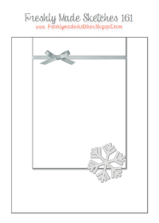
Yes, it's pretty.  Right now it's very sparkly and clean.  Later, when there is all that road dirt and sanding it won't be so pristine and pretty but right now I have to admit that it's picture perfect.  Of course I used that as my inspiration for the card that I created to enter some challenges.  The Stampin' Royalty, for example, called for silver to be used in a card while the Freshly Made Sketches had the perfect sketch for what I had in mind:
Can't you just imagine that sketch in white and silver?  

I began with a base of Smoky Slate and then added a layer of that wonderful silver-foil-dotted All Is Calm Specialty Designer Paper.  For the smaller rectangle I used a base of Silver Foil and then added a layer of Whisper White.  I heat embossed the Whisper White using Versamark and Silver Embossing Powder.  Then I added a die-cut of musical notes to the top, all the while hearing the song "Let it snow, let it snow, let it snow" inside my head.  I added another die-cut, this time a snowflake, to the bottom right of my smaller rectangle and my card was complete.  Simple but oh so pretty in real life.  Sadly silver does not photograph well, especially in the evening.


For more cards using silver, check out Stampin' Royalty.

For more cards using this sketch, check out Freshly Made Sketches.

A Top Note Raggedy Andy

I've always loved the Top Note die.  Actually it's the very first die that I bought from Stampin' Up!  It's an extremely versatile die and I can see why it's stayed current while other dies have come and gone.  Today I decided to use it for a punch art type of card.  My aim was to make the Top Note into a Raggedy Andy.  I thought the line of "stitching" around the perimeter of the die-cut made it a natural for that purpose.

First of all I began with a card base of Naturals White, followed by a layer of Soft Suede and then a layer of the dotted pattern from the Park Lane Designer Series Paper.  Now I was ready to begin my Raggedy Andy.

I cut a piece of Blushing Bride cardstock with the Top Note die for the face.  Then I cut two small ovals of Whisper White for the eyes as well as two 1/2" circles for the blacks of the eyes.  I used the Pennant Builder punch to cut a piece of Real Red for the nose and then cut another piece of Real Red twice with the small oval punch to get the lips.  The hair was easy to cut from the Real Red since we luckily have those wonderful  Fringe Scissors.  I added a slightly curved strip of Whisper White for the brim of the hat and then cut the top of the hat with the Top Note.

A bit of sponging here and there helped contour the hat and face.  A touch from the Signo Ball Pen added a sparkle to the eyes.  My black Stampin' Marker added the lines for his mouth and the lashes to his eyes.  And then I added fake stitching with my black Stampin' Marker as well.

I attached Raggedy Andy to the card using Dimensionals and then added my sentiment (from the Just Sayin' stamp set) with Dimensionals as well.  The final touch was his collar which I cut from Marina Mist with the scalloped portion of the Pennant Builder punch and then his bow tie which is simply a bow tied from Hello Honey ribbon.


For more punch art cards, check out The Paper Plunge challenge.

Saturday, 8 November 2014

Just Add Ink (and a little nostalgia)

I've been looking through a lot of my retired Stampin' Up! products lately.  It's gotten to the point where I have as many (or more) retired stamp sets as I have current and obviously I have to do something about it.  There are, after all, only so many stamp sets that a person actually gets around to using.

A stamp set such as Welcome Christmas, for example, has been sitting on my shelves, never having been introduced to ink.  Well---until now, that is.  I "discovered" the set while rummaging and trying to decide what I should sell and what I should keep and wondered why I had never used it.  There is a challenge at Just Add Ink that virtually begged for this set to be used and so a card was born.  (Oh, and if you're wondering how the battle to reduce my retired products is going, let's just say that my keep pile keeps growing while my sell pile is sadly quite small.)

The colours at Just Add Ink are evocative of an era gone by (for me, at least).  Even the Lost Lagoon colour is actually more of an old-fashioned colour than a modern colour in my opinion.

JAI 239

Along with the Early Espresso and Very Vanilla, the Lost Lagoon looked perfect for the images from the Welcome Christmas stamp set.

For my base I used Early Espresso and then added a layer of Naturals Ivory.  Then I took a piece of Very Vanilla, embossed it with the retired Pretty Print embossing folder, and then sponged over the raised print and edges using Lost Lagoon ink.  I attached the embossed piece to a piece of Lost Lagoon cardstock and then attached the combined piece to the card using Dimensionals.

I had decided to use the negative framelit from the On Film framelits set as frames for my images and so cut out two from Early Espresso cardstock.  Then, using Early Espresso ink, I stamped the two silhouette images from the Welcome Christmas stamp set on Very Vanilla (I did not ink up the little girl in the Christmas tree stamp since she would not fit into the frame).   After fitting the Very Vanilla into the framelit frames, I attached them to my card using Dimensionals.

For my sentiment, I turned to the "Noel" framelit from the Wondrous Wreath framelits dies.  I cut out one from Early Espresso cardstock and another from Gold Foil.  Then I mounted the Gold Foil just offset enough so that the Early Espresso formed a shadow under it.  I used Tombo glue to attach the sentiment to my card.

To finish up I punched out three small stars from Early Espresso and three more from Gold Foil.  I also offset those to form a "shadow" and then attached them using Tombo Glue.


For more cards using these colours, please check out Just Add Ink.

Friday, 7 November 2014

A Vintage Christmas

*Thrilled to be picked a Cut Above at the Paper Players this week!*
*Thrilled to be picked for the Top 3 for the Make My Monday Vintage challenge!*

There are a lot of different interpretations for vintage.  For some it means adding frills and flowers and almost everything but the kitchen sink.  While I admire the look of some of these cards, they aren't "me".  I love things that look vintage, but in a cleaner, more streamlined way.  As a result, when I saw the challenges for vintage cards, I went looking through my retired stamps for those images that evoked another era, a simpler time.


That wonderful Christmas Lodge stamp set, for example, immediately caught my attention.  I love the images in that set and they definitely make me think of what winters long ago must have been like.  Of course the Winter Memories stamp set virtually "sprang" into my hands as well.  Those images are priceless and so well drawn.  Together, they gave me my vintage card.

I decided to create a scene.  I stamped the images I had chosen for my card onto Very Vanilla using Soft Suede ink to give them a look of yesteryear.  After all, during the 19th Century most photographers converted the metallic silver (black and white) with a chemical process involving the Sepia cuttlefish in order to help preserve the prints.  This is why the sepia prints have lasted so well for over a century.  I'm a photography geek so old-time photography has always fascinated me.

You can see the scene I've created is a combination of a whole lot of techniques.  I've added clouds in the background by sponging over a template that I made a while back.  I tore strips of Very Vanilla and sponges them.  I fussy-cut all my images.  I could have stamped and masked the lodge before sponging the clouds, but I wasn't sure at the time if I was going to put it on Dimensionals so I just fussy-cut while I was on a roll.


In a lot of these old photographs you can see just a bit of colour in places, where the photographer has inked in colour to spotlight portions of his finished photograph.  I tried to get the same effect by adding a very light watercolour wash over the tree and the little girl's coat and hat as well as the snow-girl's apron.  I think the result is sufficiently faded looking to give that old-time hand-coloured effect.


I also added quite a bit of the Silver Dazzling Details to all the trees just because that's something you see in a lot of these old cards and postcards:  fine silver glitter.  The bit of retired Victoria crochet ribbon and Antique Brad just finish off the old-time look for me.

My card is on a base of Naturals Ivory with a layer of Soft Suede.  The rest of the cardstock used is Very Vanilla.


For more cards of a vintage nature, check out The Paper Players.

For cards that are using sepia tones as well, check out Merry Monday Christmas Challenge.
And for another challenge that calls for vintage cards, check out Make My Monday.


Tuesday, 4 November 2014

Simple Joy

What I was aiming for:  a simple card in non-traditional Christmas colours.  I achieved that by using one of my top favourite stamp sets, Lovely as a Tree along with a much-loved but retired stamp set, Winter Memories.

I used a base  of Naturals White, then a layer of Basic Black and then a layer of Whisper White which I first prepared by stamping.  I used a small acrylic block and three blues:  Soft Sky, Pool Party and Coastal Cabana.  First I spritzed the Whisper White with alcohol, then I stamped the three colours using my acrylic block, and finally I spritzed more alcohol over the stamped colours.

Once that dried, I stamped over the blues with my pine tree stamp using Memento black ink.  On another little piece of Whisper White I stamped only the little boy, dog and snowman from the Winter Memories stamp using Memento black ink.  Then I coloured the images using only the same blues and a touch of Smoky Slate and skin tone.  I also stamped only the "joy" from the stamp in the hostess Good Greetings stamp set centred just below the tree.

I cut around the images I had coloured and used Dimensionals to attach the piece in the lower right hand portion of the card.  And that completed my simple Christmas card.


You can see I flipped the sketch from the Just Add Ink challenge over on its side.  For more cards using this sketch, check out Just Add Ink.


For more cards using non-traditional colours for their Christmas cards, check out "Less is More".

Monday, 3 November 2014

Remember my closing Scalloped Tag Topper Box?

If you read my other blog, you'll remember my closing Scalloped Tag Topper Box.  I shared the template and step-by-step instructions with anyone who wished to try one on the condition that they would not sell the instructions or take credit for the design themselves.  Well, it's time for me to have some fun with that box again.  This time I'm going to enter a Thanksgiving box into two challenges.

I'm not going to go into details for the box again.  I've posted everything and provided clear photo instructions here if you're interested.  This post is about the same box but making it different.

I began with a box cut from Naturals White.  I wanted something light but neutral for my base.  For my next layer I added Cajun Craze, which worked perfectly with the retired Orchard Harvest Designer Series Paper that I had chosen to use.  I love all the bright colours in that paper and picked the apple pattern for two sides of my box and the corn pattern for the other two sides.  For the handles, I chose the stitched pattern which pulled all the colours together.

I added some leaves cut with the Fun Fall Framelits and pieces of Cajun Craze, Hello Honey and Pear Pizzazz to a banner on which I had stamped my sentiment from the retired Day of Gratitude stamp set.  A piece of Hello Honey ribbon and a retired Designer Naturals button finished it off.


For more projects that are not cards, check out The Paper Plunge Challenge.

For more boxes for Thanksgiving, check out The Friday Mashup.


Sunday, 2 November 2014

Ode to Remembrance Day --- keeping it Clean and Simple!

With all that is happening in Canada and in the world, Remembrance Day is very much on my mind.  My Dad was a veteran and gave out poppies for donations and so, when I come across veterans doing so now, I feel compelled to buy a poppy "for him".  This card is for Remembrance and for my Dad.

I kept the card very Clean and Simple, making it a single sheet creation.  I had this idea in my head and, thankfully, had the stamps to bring that idea into reality.  I used Whisper White for my cardstock because it stamps cleanly and gives crisp images.  For my background stamp, I used the Hero Stamps "Delicate Blossoms".  I love the poppies in that set but only inked up one.

Over that poppy, I stamped the silhouette from the Stampin' Up! "For Your Country" stamp set.  I put it over towards the right side to avoid interference from the dark centre of the poppy.  Luckily I also had a sentiment that would work for my card and that came from the Stampin' Up! Project Life "Remember This" stamp set.

I coloured the poppy using my Cherry Cobbler Blendabilities.  I also went over the silhouette with my Stampin' Basic Black marker just to give it more depth.  Finally I added a touch of green to the grass.

I left a lot of white space to call attention to my images.  I hope you like it.


There are two challenges into which I'm entering this card, both of which call for CAS (clean and simple) cards.

Please check out CAS on Sunday.

And also check out Addicted to Stamps and More.

Saturday, 1 November 2014

Baby, It's Cold Outside!

I love it when old and new work together, don't you?  Some of the retired stamp sets and Designer Paper still tug at my heart when I see them and I'm thrilled when I get a chance to dig them out and use them again.  That's what happened with the Best of Snow stamp set and the Sweater Weather Designer Series Paper.  I finally got a chance to use them with the two challenges I found this week.

I really love the sketch that they've offered at the Paper Craft Crew Challenges:

Paper Craft Crew Card Sketch 116

And thought the sketch would work beautifully with the colours at the Color Throwdown Challenges:


The adorable little hedgehog building a snow-hedgehog is one of my favourite images and I knew it would be great for this card.  Looking through my Designer Paper, I found the right colours in the Sweater Weather paper and so my card was on a roll.

I began with a base of Pacific Point, added a narrow layer of Basic Black to form a thin frame for my next layer which was Whisper White.  I spritzed the Whisper White using my Pacific Point Stampin' Marker and the retired Colour Spritzer Tool.  

For my small rectangles, I made one with a base of Basic Black and a layer of the Designer Paper.  The top small rectangle, however, I cut from Basic Black using my On Film framelit and stamped a small piece of Whisper White to fit the centre.  The stamp, of course, was of the little hedgehog.  For the image I was able to add the yellow and orange in the scarves and carrot nose, some more black to the "coat" and a bit of Pacific Point to the snow.

I stamped my sentiment using the Project Life Holiday Cheer stamp set with Pacific Point ink and cut that out using my 1" circle punch.  I cut a backing of Pacific Point with my 1 1/4" circle punch.  The final touches were a piece of the 3/4" Basic Black Chevron Ribbon and a banner of Dazzling Diamonds Glimmer paper.

For more cards using this sketch, check out the Paper Craft Crew Challenges.

For more cards using these colours, check out the Color Throwdown Challenge.

For more cards featuring adorable little creatures, check out jingle belles.